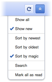
The more eagle-eyed Reader users have noticed a few tweaks being made to Reader’s mobile interface over the past few days:
- Google has brought over a few more features from the desktop version of Reader: magic ranking and search. Both can be found in the option drop-down menu.
- For better consistency with the desktop version, Google has made the titles of items be links to the original page
- The top of each item now has “collapse” and “next item” links. This way there’s always a consistent space for your thumb to hit so you can advance to the next item.
Since Google know the best mobile content is short and sweet, they’re going to leave you with that. Feel free to get in touch with them on Twitter or on their help group with feedback on these changes.
 Omid Farhang

