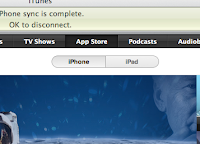
If you’ve updated iTunes to the latest version, 9.1, you may have noticed that iPad and iPhone apps are now separated by a tab at the top of the page. Switch tabs and you will pull up device-specific views of the App Store, which renders the entire experience a bit more elegant and better-organized than before.
This is a slight change from the old method, which previously divided apps into categories like “New and Noteworthy” and “Staff Favorites.” There is a downside to the new design, however: If you are browsing a category of iPhone apps and want to begin looking at similar apps for the iPad, you have to start your search over on the front page.
However, keep in mind that apps that are available for both the iPad and the iPhone/iPod Touch will show up under both pages.
It’s certainly a matter of preference, but we feel that the new design is better. How do you like the new App Store? Please let us know in the comments.
 Omid Farhang
